
One of the first intermediate skills that I cover in any workshop or class I teach on presentation design is the use of graphs. Most presentation software have some easy to use tools to create graphs, but the same educational and design principles still apply and might not be intuitive from using the tools themselves.
Take this graph, for example:
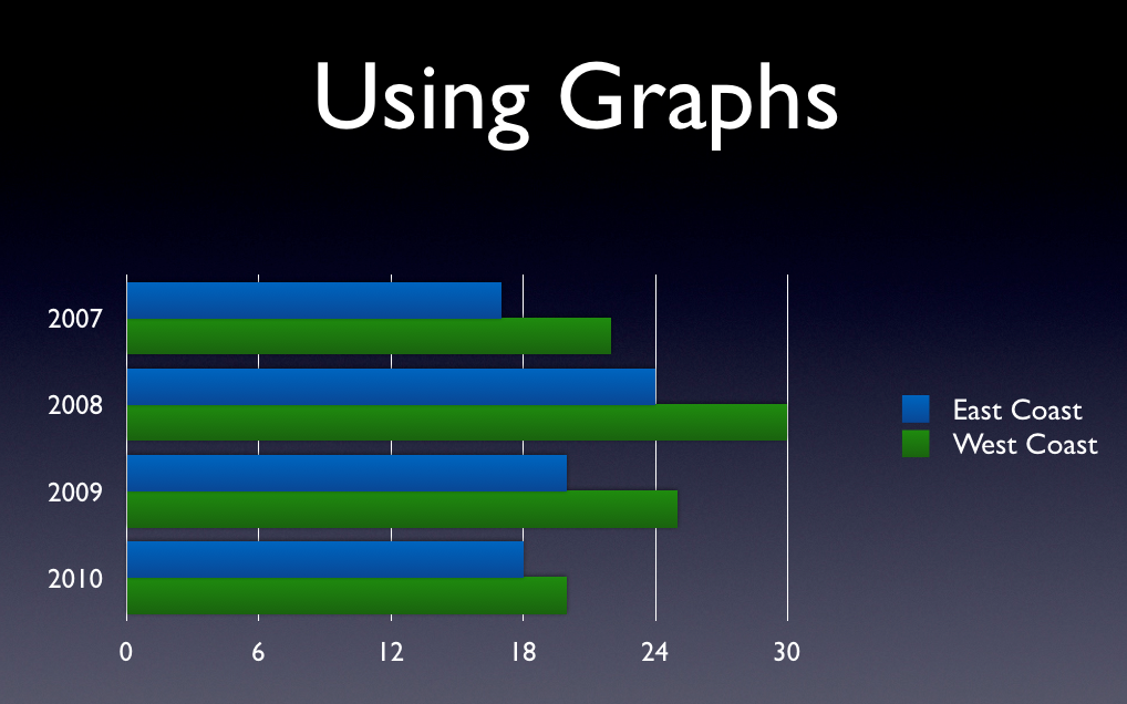
Example 1: Focusing on the axis, this is a reasonable ratio to compare the data (there are some other improvements that can be made, but ignore that right now).
However, by changing the axis, you can skew the interpretation of the data.

Example 2: The graph above has widened the range of the axis, hiding the difference between the two across the four years.

Example 3: Here the axis starts at 15 instead of 0. So, the difference between the two is falsely exaggerated.
Here is an example of a great graph from the New England Journal of Medicine. To avoid the problem of ratios, everything is simply labeled for direct comparison.

