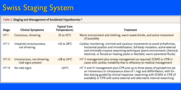
So, I was recently asked to give a talk on Accidental Hypothermia. While I was making the talk, I decided to take a short-cut (aka, I got lazy) and put in a clipped portion of a graph from one of the key papers instead of recreating it myself or trying to use my supergraphic correctly.

Of course, the slide looked great when I was making the lecture, but it projected horribly! I was standing about 1/2 of the way back in the room and I couldn’t read it myself. This got me thinking. How big is the font in graphics like these? Perhaps if I knew how small the font actually was, it would help motivate me from making this mistake again.
So, I cut out a portion of the graphic and decided to use the phrase “impaired consciousness” to test font sizes.
As you can see, the font in the graphic is only 16 pt. When directly compared to larger fonts, it seems ridiculous to use in any slide or presentation.
Lesson learned.

