Hello everyone,
I’m spending the week in Toronto, Canada for the annual National Medical Association meeting.
No new material this week, but will get back to work once I return.
Have a great weekend!
Tyson

Hello everyone,
I’m spending the week in Toronto, Canada for the annual National Medical Association meeting.
No new material this week, but will get back to work once I return.
Have a great weekend!
Tyson
Prompted by a few presentations I have seen recently, I wanted to write briefly about an easy change to your slides you can use to immediately start to improve your presentations. That is, using the entire slide for images and text.
Many times, the backgrounds and templates we choose will subconsciously constrain our use of the slides. This is very common when we are mandated to use template slides for branding, but not allowed to step outside of the template when needed.
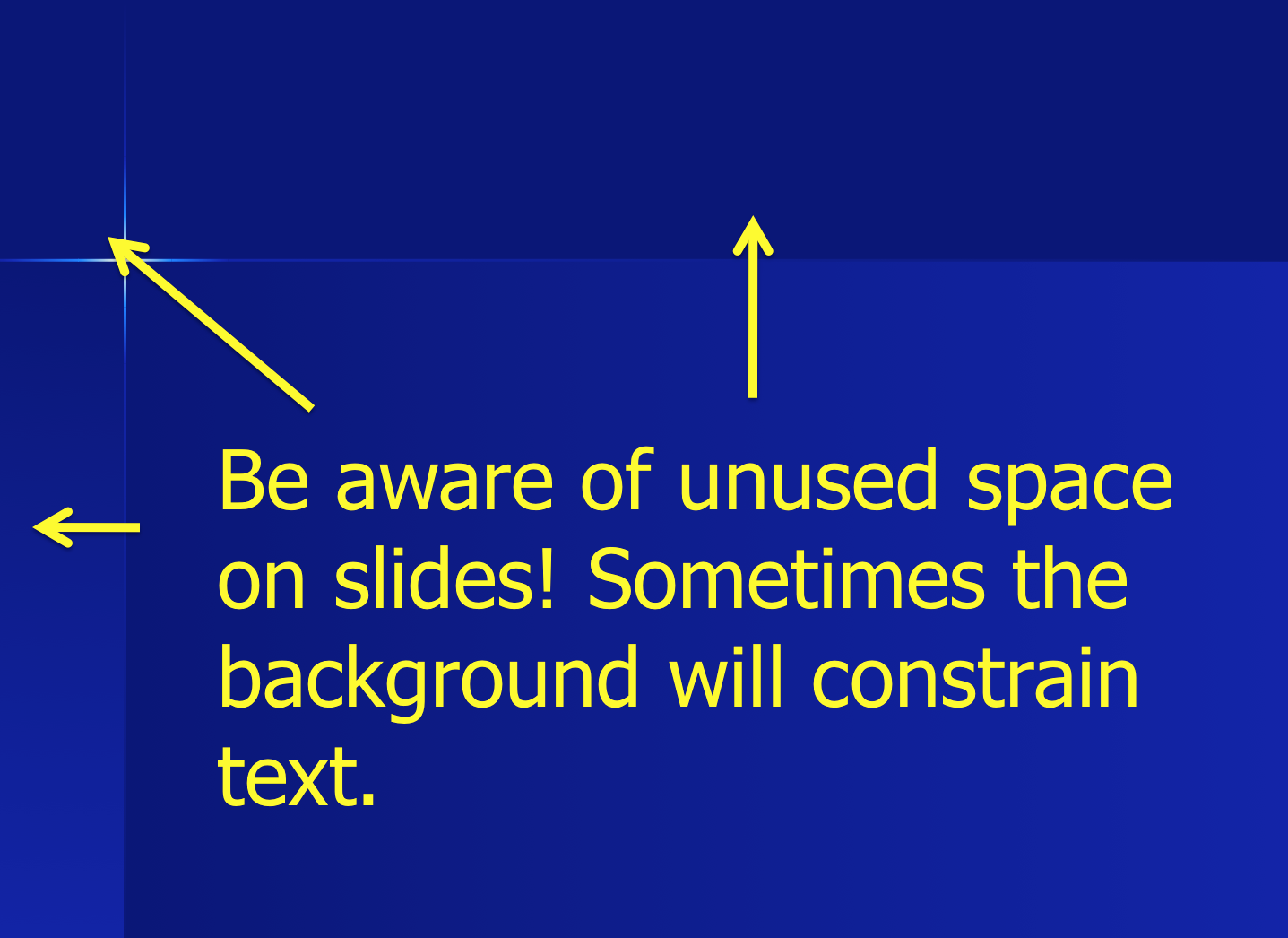
If you are following good presentation design principles, then this will likely not affect text much, as you will know to condense your use of text and just use the space allotted. Where there is real impact is the use of images.
Most of use will instinctually put the image in a corner:

But why not use the entire slide? [aka, “No one puts Baby in a corner!” I’m dating myself, but it was a good movie.]

The image is easier to see, the slide looks better and more professional.
Another example with a medical image:

Now using the entire slide:

Very commonly in our educational presentations, we use images to let the audience examine the slide (exploratory) or point out key findings (explanatory). Much easier to do when the audience can easily see the image and details.
A few important points about using the entire slide when using images:
Oh, how I wish there were a floating dry-erase board drawing arm for all of my presentations!
Below is a video of a talk given by Sir Ken Robinson, education and creativity expert, that was adapted to an RSAnimate presentation. With over 10 million views, I believe we can call this one “essential.”
When you watch it, watch it twice. First, for the message, then again for the beauty of the visuals themselves. The sketches add so much impact to the already amazing presentation that Robinson gives.
.
This stuff is great!
 (Click image to go to site)
I get asked very often about Prezi as a presentation tool. Thought it would be worthwhile to write about it.
Prezi is a cloud-based presentation design tool that uses zooming and “paths” to move through the presentation instead of the standard slides. It is a great way to create digital stories and change the pace from the normal slide-based presentation software. One of the most impressive features of Prezis is the ability to go off the path and explore any part of the presentation at any time. This feature lends itself extremely well to medical education, as we are sometimes locked into a set path because of inability to deviate from the set order of our slides (although there are a few way to address this).
I’ve used Prezi for a few presentations now. Below is an example of one of my VERY early Prezis as well as a few other great ones.
(Click on images to view Prezis and make sure to explore the features while viewing)
Innovations in Educational Technologies
(this one is mine, as you will quickly be able to tell. Did I mention this was an early attempt?)

.
Social Media in Medical Education

.
Honoring Dr. Martin Luther King

.
Prezi Pros vs Cons
Pros:
Cons
The bottom line: Prezi is a great presentation software platform, but has a huge learning curve, and still doesn’t make up for the good ol’ design principles you have come to know and love. Without understanding and incorporating educational design principles, it will be a great visual feat with no content (similar to the “Dr. Fox effect”).
I’m interested in your opinions on Prezi as educators, specifically in medical education. How have you used it in your teaching? What other opinions do you have about it? If you are willing to share, please reply to the post or send a message to @designformeded using the Twitter box on the right.
