Before and After – Headache in the ED

I have been reading and developing this presentation design niche for about 5 years now. Sometimes, I come across some of my old presentations and compare them to the newer presentations. It’s interesting to see some of the development and progression across time.

Here is the “before” of a presentation about headache in the ED:

Here is the “after” version. I consider this an early stage of my development:

Good times…


Themes vs Backgrounds

When starting a new presentation, you have a choice to choose a “theme” in the software presentation. Most of these are actually just backgrounds. They may be stylistic, but don’t carry a consistent idea through the entire presentation.

Some of the best examples of a true theme (and a source of presentation envy for me) are in presentations by one of my colleagues and an up-and-coming star in the world of EM and Ethics, Dr. Nathan Allen. Here is an example of one of his presentations:

You can see that the APPLE serves as his pneumonic and a clever theme running through the presentation.

All About Graphs

One of the first intermediate skills that I cover in any workshop or class I teach on presentation design is the use of graphs. Most presentation software have some easy to use tools to create graphs, but the same educational and design principles still apply and might not be intuitive from using the tools themselves.

Take this graph, for example:

Example Graph 1

Example 1: Focusing on the axis, this is a reasonable ratio to compare the data (there are some other improvements that can be made, but ignore that right now).

However, by changing the axis, you can skew the interpretation of the data.

Screen Shot 2013-03-25 at 12.29.50 PM

Example 2: The graph above has widened the range of the axis, hiding the difference between the two across the four years.

Example Graph 3

Example 3: Here the axis starts at 15 instead of 0. So, the difference between the two is falsely exaggerated.

Here is an example of a great graph from the New England Journal of Medicine. To avoid the problem of ratios, everything is simply labeled for direct comparison.

Example Great Graph 1

What do you mean I can’t use a picture of my dog?

photo-4

This little guy is Grayson. He is one of two of our Yorkies (total of 10 lbs between the two of them). I call him “Beast” in public, of course. He used to regularly show up in presentations as a way to include images and breaks. It turns out that he was hindering my audience’s learning.

Bartsch and Cobern (2003) found that students actually perform worse in memory and recognition tasks when the images used were non-relevant. This makes sense to me because as we are learning, we are actively trying to form connections and relate our new learning to prior knowledge. As cute as he is, Grayson (or pics of your family, latest travel, etc…) get in the way of processing. So, when presenting ideas and data, make the images relevant to the material being presented.

However, one of the things that has not been studied is whether the placement of the non-relevant image matters. It’s one thing to talk about membrane potential on a beach background, but it may be another to build in a break that incorporates personal “non-relevant” images that help build your connection to the audience.

References:

Bartsch R, Cobern K. (2003) “Effectiveness of Powerpoint presentations in lectures.” Computers and Education. 41(1):77-86

The Structure of Great Presentations by Nancy Duarte

Ok, so this isn’t one of the evidence-based principles for presentation design, but it covers a topic that I think is essential for great presentations. That is, the structure of presentations.

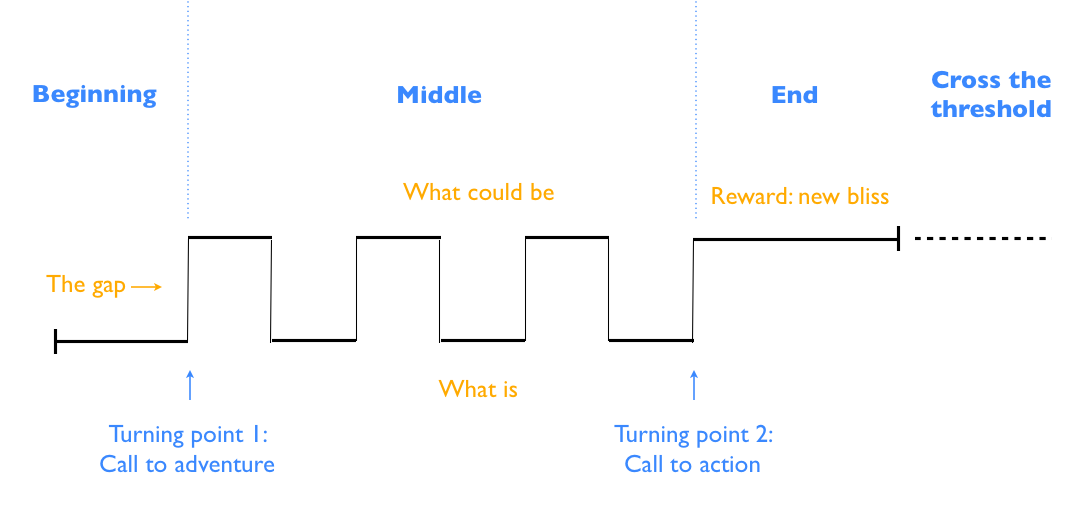
In her book Resonate, Nancy Duarte dissects the key components of great presentations from great presenters and comes up with the following:

Rhythm of Presentations 1

She makes a compelling argument that one of the keys to great presentations is to identify the gap and call your audience to action. When I saw this for the first time, I immediately thought that this was applicable to medical education, we just have different terminology.

My version of her diagram:

Rhythm of Great Presentations 2

The “gap” is the zone of proximal development where we help students reach a higher level of understanding than they would on their own.

This was a real epiphany for me and it links the theoretical considerations of great presentations with the educational principles we use to educate our learners.

In February 2012, Nancy gave a TED talk about the structure of presentations that can be viewed here.

References:

Duarte N. (2010). Resonate. New Jersey: John Wiley and Sons, Inc.

The Magic Number 4?

Screen Shot 2013-03-20 at 10.55.46 PM

Another possible myth of presentation design is that the magic number for retention is:

7 +/- 2

It appears that the actual magical number is closer to 4.

A psychologist by the name of Alan Baddeley dug up the number ofter quote from the research paper by George Miller and actually found that it was a talk from a professional meeting, not research!

Baddeley did his own studies to support the number 4 as the true “magic” number for memory and information processing. However, this has not been studied extensively in medical education, especially with the ideas of organizing and anchoring.

So, for now, we can try to build our presentations around the number 4, but may be able to stretch this much further when other educational principles are applied.

References:

Miller, G. (1956) “The magical number seven plus or minus two: Some limits on our capacity for processing information.” Psychological Review. 63:81-97

Baddeley A. (1994) “The magic number seven: Still magic after all these years?” Psychological Review. 101:353-6

The Truth about Serif vs San Serif Fonts…

I have long wondered about some of the “rules” of presentation design. One of them which I used to mention in my own classes was the classic Serif vs. Sans Serif debate.

Screen Shot 2013-03-19 at 11.17.05 PM

So according to Hoffman, et al. 2005, it turns out that the real key may be READABILITY. When asked about their preferences for projected fonts on screen, these were the top choices in order of preference. It is interesting that 3 of the 4 are, in fact, sans serif fonts, but don’t be so quick to throw out stylistic yet highly readable fonts like Times if they work for your presentation.

References:

Hoffman B, White A, Aquino N. (2005) “Screen text readability: Ease, accuracy, and speed of some common computer typefaces.” IVLA Conference Proceedings

Exley K, Dennick R. (2009) Giving a lecture: From presenting to teaching. 2nd edition. New York, New York: Routledge