The Dr. Fox Lecture

Screen Shot 2013-06-24 at 9.22.20 PM

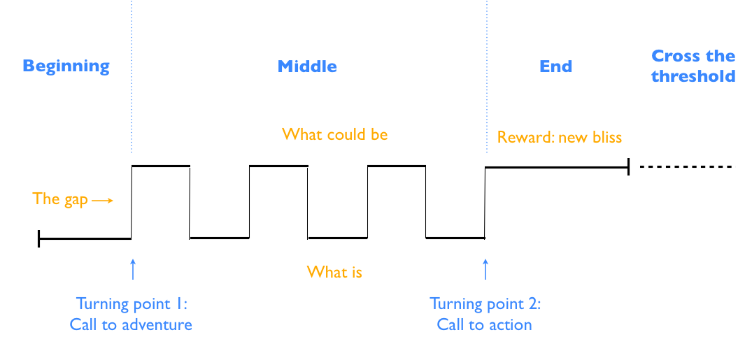
The phenomenon in which the style of a lecture masks its poor content is known as the “Dr. Fox Effect.”

In the 1970’s, three researchers hired an actor, Michael Fox, to “teach charistmatically and nonsubstantively on a topic about which he knew nothing.” The lecture, titled “Mathematical Game Theory as Applied to Physician Education,” was attended or rewatched via video by a total of 55 participants (physicians, educators, and administrators).

This is a video of the lecture:

.

This is a video of an edited version with clips added:

.

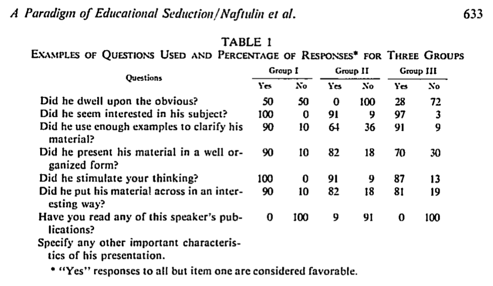
Table 1 from the paper shows the responses that the participants had to the survey.

  • Group 1 – 11 psychiatrists, psychologists, and social-worker educators
  • Group 2 – 11 psychiatrists, psychologists, and psychiatric social workers
  • Group 3 – 33 educators and administrators with 21 of these holding master’s degrees, 8 with bachelor’s degrees, and 4 with other degrees not specified

Screen Shot 2013-06-24 at 9.15.23 PM(Click to enlarge)

The authors concluded that “style was more influential than content in providing learner satisfaction” for those participants in the study. They were specifically aiming to address the idea that student ratings of educators had more to do with personality than with educational content.

What implications does this have for us as medical educators? There are many different theories that can come from this study. The authors themselves write “there is much more to teaching than making students happy.” This is very true, but much like attention, there is an undeniable effect of “performance” on gaining interest and motivating learners. The authors note that “despite having been misinformed, the motivation of some respondents to learn more about the subject matter persisted.”

Although much more research has to be done in this area to answer the question effectively, my own answer is summarized in a quote I use frequently in my presentations:

“Successful teaching is a performance, and the sooner we make peace with that, the better.” – Tauber, et. al.

References:

Naftulin D, Ware J, and Donnelly F. “The Doctor Fox Lecture: A Paradigm of Educational Seduction.” Journal of Medical Education. 1973;43:630-5

Tauber R, Mester C. Acting Lessons for Teachers: Using Performance Skills in the Classroom. Praeger, 2007. 2nd edition.

Learning from My Mistakes

So, I was recently asked to give a talk on Accidental Hypothermia. While I was making the talk, I decided to take a short-cut (aka, I got lazy) and put in a clipped portion of a graph from one of the key papers instead of recreating it myself or trying to use my supergraphic correctly.
Screen Shot 2013-04-21 at 1.12.16 PM

Of course, the slide looked great when I was making the lecture, but it projected horribly! I was standing about 1/2 of the way back in the room and I couldn’t read it myself. This got me thinking. How big is the font in graphics like these? Perhaps if I knew how small the font actually was, it would help motivate me from making this mistake again.

So, I cut out a portion of the graphic and decided to use the phrase “impaired consciousness” to test font sizes.

Screen Shot 2013-04-21 at 1.12.37 PM

As you can see, the font in the graphic is only 16 pt. When directly compared to larger fonts, it seems ridiculous to use in any slide or presentation.

Lesson learned.

Themes vs Backgrounds

When starting a new presentation, you have a choice to choose a “theme” in the software presentation. Most of these are actually just backgrounds. They may be stylistic, but don’t carry a consistent idea through the entire presentation.

Some of the best examples of a true theme (and a source of presentation envy for me) are in presentations by one of my colleagues and an up-and-coming star in the world of EM and Ethics, Dr. Nathan Allen. Here is an example of one of his presentations:

You can see that the APPLE serves as his pneumonic and a clever theme running through the presentation.

The Structure of Great Presentations by Nancy Duarte

Ok, so this isn’t one of the evidence-based principles for presentation design, but it covers a topic that I think is essential for great presentations. That is, the structure of presentations.

In her book Resonate, Nancy Duarte dissects the key components of great presentations from great presenters and comes up with the following:

Rhythm of Presentations 1

She makes a compelling argument that one of the keys to great presentations is to identify the gap and call your audience to action. When I saw this for the first time, I immediately thought that this was applicable to medical education, we just have different terminology.

My version of her diagram:

Rhythm of Great Presentations 2

The “gap” is the zone of proximal development where we help students reach a higher level of understanding than they would on their own.

This was a real epiphany for me and it links the theoretical considerations of great presentations with the educational principles we use to educate our learners.

In February 2012, Nancy gave a TED talk about the structure of presentations that can be viewed here.

References:

Duarte N. (2010). Resonate. New Jersey: John Wiley and Sons, Inc.