Just Imagine: New Paradigms for Medical Education

Screen Shot 2013-09-19 at 10.51.24 AM

Another great article from the same issue of Academic Medicine as “Medical Education Reimagined.” This article focuses on the shortcomings of our current system of medical education and offers a review of the current “disruptive innovations.”

The “second Flexner report”

The authors cite the 2010 publication “Educating Physicians: A Call for Reform of Medical School and Residency” as identifying 4 goals to improve medical education:

  1. Standardization of learning outcomes and individualization of the learning process
  2. Integration of formal knowledge and clinical experience
  3. Development of habits of inquiry and innovation
  4. Focus on professional identity formation

Shortcomings and problems

“For all of it’s traditional successes, the current model of medical education in the United States and Canada is being challenged on issues of quality, throughput, and cost, a process that has exposed numerous shortcoming… A radical change in direction is required because the current path will not lead to a solution.”

This article doesn’t hold back any punches and list several key shortcomings in the current system including:

  • “Arcane assessment methods
  • Learning focused on test performance
  • Lack of direct observation
  • Lack of knowledge assessment or problem-solving ability
  • Productivity pressures faced by faculty
  • Inattention to improving residents’ teaching skills
  • Gaps in trainees’ clinical exposure
  • Unmet need to train more physicians
  • Medical student debt

Disruptive innovations

“In an ideal future state, all students would experience every essential inpatient and ambulatory clinical experience, would be observed during these encounters, and would receive formative feedback on such interactions to guide them in improving their knowledge, skills, and socialization to the profession.”

Several of the disruptive innovations now available to use are:

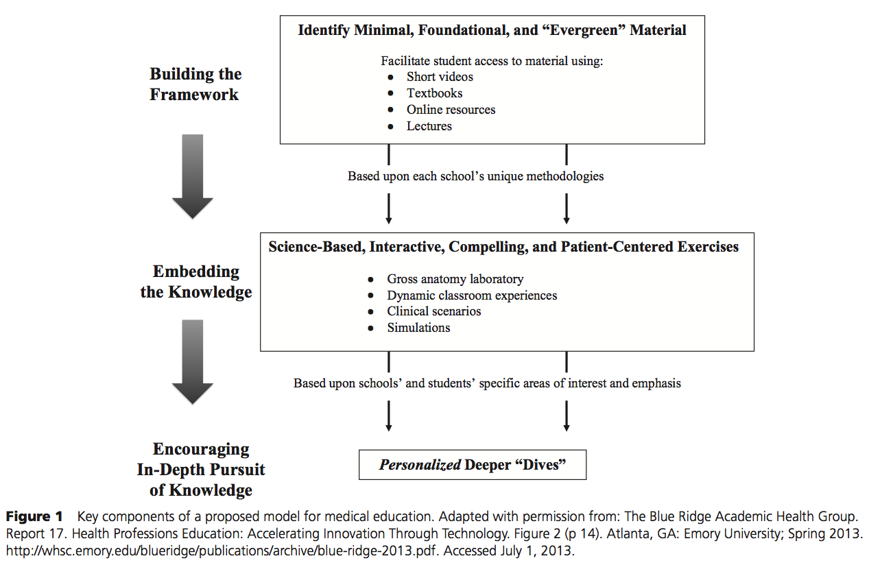
  • Flipped classrooms – eLearning content frees up class time for active learning
  • Massive open online courses (MOOCs) – 24/7 access to low cost, collaborative courses forstering “knowledge duplication”
  • Digital badges – electronic images and tracking that can follow learners through their lifetime

The authors’ vision is to achieve the goals set forth by the “second Flexner report” by transforming medical education with disruptive technologies. 

We are living in exciting, “disruptive” times and I look forward to see how the re-imagining of medical education will change us.

References

Cooke, et al. “Educating Physicians: A Call for Reform of Medical School and Residency.” San Francisco, CA: Jossey-Bass; 2010

Mehta, et. al. “Just Imagine: New Paradigms for Medical Education.” Academic Medicine. 2013; 88(10)

Medical Education Reimagined: A Call to Action

Screen Shot 2013-09-13 at 9.07.34 PM

This is one of those articles that may (hopefully) help define a new era of medical education!

Charles Prober (senior associate dean at Stanford SOM and author of the article “Lecture Halls Without Lectures”) and Salman Khan (creator of the Khan Academy) have co-authored an editorial calling for “a collaborative, multi-institutional effort to reimagine medical education.” This “reimagining” recognizes that the current medical system is generally inflexible to individual learners and embraces the flipped classroom model at it’s core.  

They argue that the convergence of 3 key factors compels a need for change:

  1. The modern “digital native” learner
  2. Exponentially growing biomedical knowledge
  3. A dated medical education delivery system

To do this, they propose the following:

Screen Shot 2013-09-13 at 9.00.07 PM(Click to enlarge)

Building a framework of core knowledge

This is the central element of the proposal and calls for a curricular change to focus on medical knowledge that is “evergreen,” or foundational and known to be true. They then call for the creation of a medical school collaborative to identify the core content, and based on this, to create short (~10 minute) videos of this core content.

Embedding the knowledge in richly interactive, compelling, and engaging formats

Interactive, engaging sessions add meaning to the knowledge and solidify the learners understanding of the material. Based on the experiences at Stanford, they also note that the sessions with video-based didactic instruction must be time neutral compared to the current model.

Encouraging in-depth pursuit of knowledge in some, but not all, domains

Here, the key is “to tap into and support the individual learner’s aptitude and passion.” Deeper “dives” into the curriculum and driven by learners and areas of expertise in each school. It also respects that some students may not feel the need to do so.

This commentary is rich with ideas to embrace technology and the flipped classroom model for our learners. It is a model that was developed for K-12 education, but as the authors note, equally relevant to medical education. There are also several keys to this model which I think are worth mentioning more in depth:

  1. Collaboration – it calls for medical schools to work together to define a core content across all schools
  2. Embracing technology – using technology not only for the core content, but also the interactive sessions to reinforce key ideas and material
  3. Encouraging multiple formats – recognizing that there will need to be several videos formats to fit various learning styles.
  4. Individualism – while collaboration is key to this endeavor, medical schools maintain individualism in the style and delivery of the interactive sessions and the areas of expertise for the “deep dives” offered to students
  5. Tailored education – students may (or may not) choose to go beyond the curriculum in “deep dives” in certain areas

I am energized by this article and excited to be an educator right now!

References

Prober C, Khan S. “Medical Education Reimagined: A Call to Action.” Academic Medicine. 2013;88(10):1-4

Book Review – Clear and to The Point

This is another book that helped to form my early interest in presentation design.

clear-and-to-the-point-powerpoint-book

Stephen Kosslyn is a professor of psychology who has written many papers and books on cognitive psychology and cognitive neuroscience. This book follows from one of his earlier works, Elements of Graphic Design. This is a very well-written and practical book that gives some great examples of “Do’s” and “Dont’s” to improve slides in presentation.

Kosslyn offers 3 goals that “virtually define an effective presentation:”

  1. Connect with your audience
  2. Direct and hold attention
  3. Promote understanding and learning

He then proposes 8 principles to achieve those goals:

  1. Principle of Relevance – Communication is most effective when neither too much or too little information is presented
  2. Principle of Appropriate Knowledge – Communication requires prior knowledge of pertinent concepts, jargon, and symbols
  3. Principle of Salience – Attention is drawn to large perceptible differences
  4. Principle of Discriminability – Two properties must differ by a large enough proportion or they will not be distinguished
  5. Principle of Perceptual Organization – People automatically group elements into units, which they then attend to and remember
  6. Principle of Compatibility – A message is easiest to understand if its form is compatible with its meaning
  7. Principle of Informative Changes – People expect changes in properties to carry information
  8. Principle of Capacity Limitations – People have a limited capacity to retain and to process information, and so will not understand a message if too much information must be retained and processed

Quotes from the book

“…you don’t want the audience to be lost in the admiration of the background of your slides.”

“Just as you wouldn’t blame Microsoft Word for every bad article you’ve read, you shouldn’t blame the Powerpoint program for every bad presentation you’ve seen.”

References

Kosslyn, S. Clear and to the Point. 2007. Oxford Press.

An oldie, but goodie…

Screen Shot 2013-08-30 at 10.18.27 PM

As I was skimming journals for a lit search on another project, I came across this interesting article:

Screen Shot 2013-08-30 at 10.18.04 PM

This article appeared in BMJ in 2003 and it a little dated (a few paragraphs talk about the use of overhead projectors and 35mm slides) but still had some great pearls to pull out if it.

“The nature and qualities of the teaching materials that you use can have a substantial effect on the educational experience of your students.” 

Very true. This is the whole idea behind presentation design and now has research to support this idea (see articles by Dr. Issa).

“Highlighted information helps to emphasize important issues or pivotal points in a developing argument.”

Also very true. One of the most common mistakes I see in presentations is a lack of focus on key points. The presentations turn into “slideuments” that are just large amounts of text in slide format.

The other side of this point is to highlight too much…

Screen Shot 2013-08-30 at 10.30.11 PM

“It is important that both the type of educational event and the teaching materials that supplement it are targeted at what your students need to learn. Targeting, therefore, requires an awareness of what knowledge and skills your students already have.”

Perhaps the most important sentences in this article because they hit so many important points. First, this idea that we have to tailor our teaching to our learners. This is a critical first step in designing educational activities. As much as I love presentation design, there are times when it isn’t even the best way to teach, and we have to consider this first before reflexively creating a powerpoint anytime we are asked to teach anything. This also implies that the same topic may be delivered differently based on the learners and educational goals. Second, teaching materials supplement educational activities. They should never be the central focus. Third, the idea of finding out what your students know related to the educational theme of Organizing and Anchoring. Activating prior knowledge and using the zone of proximal development aids in learning.

“…remember, [technology] is just another educational tool.”

Always important to remember, especially given the explosion of technology in the last few years.

Overall, this article was a nice, quick read that hid some great pearls that are still true for presentation design, but also gave some historic perspective on presentation tools and design ideas at the time.

Screen Shot 2013-08-30 at 10.58.12 PM

HA! Numbering slides…. classic!

References

Farrow R. “Creating Teaching Materials.” BMJ. 2003;326:921-3

Presentation by Dr. Stacey Poznanski

At the Council of Residency Directors in Emergency Medicine meeting in 2013, I discovered a person that loves presentation design as much as I do. I am hoping that she joins me soon on this blog, as well. Her name is Dr. Stacey Poznanski. She was gracious enough to share some of her slides from a presentation she gave with 3 colleagues at the 2013 Society for Academic Emergency Medicine meeting. I was also humbled that she chose to use some of my slides in her own presentation.

.

Enjoy!

Book Review – Presentation Zen

This is one of the other great “must-have” books for presentation design enthusiasts!

photo-4

Presentation Zen is very complementary to Slide:ology and very different in many ways as well. It was one of the first texts that I read during my “presentation design fellowship.” Presentation Zen is “about communication and about seeing presentations in a slightly different way, a way that is in tune with our times.” It is described as an “approach” to presentations. In it, Garr makes the case for this approach and give many amazing examples of slides and people that have implemented these ideas with great success. Like Slide:ology, the “weakness” of this book (probably more accurate to describe it as my own need this book doesn’t cover) is the integration of these ideas with education principles. But, that’s what I’m here for, I guess.

Quotable quotes from the book:

“Simplicity is the ultimate sophistication.” – Leonardo da Vinci

“Such power there is in clear-eyed self-restraint.” – James Russell

“Our lives are frittered away by detail: simplify, simplify.” – Henry David Thoreau

“By stripping down an image to essential meaning, an artist can amplify that meaning.” – Scott McCloud

“The more strikingly visual your presentation is, the more people will remember it. And more importantly, they will remember you.” – Paul Arden

References

Reynolds, Garr. Presentation Zen. 2008. New Riders.

Another Great Presentation by Dr. Trevonne Thompson

As I mentioned in the last post, I spent last weekend in beautiful Toronto, Canada for the annual National Medical Association meeting. One of the highlights of the meeting is always to learn from one of my presentation design mentors, Trevonne Thompson. He was gracious enough to let me add his presentation to the website.

His presentations are always clean, crisp, and concise. I plan on taking a few cues from this one as well, including the subtle white on blue slide template that doesn’t sacrifice a lot of the space on the slide while still adding color.

.

Good times.

Use the Entire Slide

Prompted by a few presentations I have seen recently, I wanted to write briefly about an easy change to your slides you can use to immediately start to improve your presentations. That is, using the entire slide for images and text.

Many times, the backgrounds and templates we choose will subconsciously constrain our use of the slides. This is very common when we are mandated to use template slides for branding, but not allowed to step outside of the template when needed.

Screen Shot 2013-07-19 at 11.20.09 AM

If you are following good presentation design principles, then this will likely not affect text much, as you will know to condense your use of text and just use the space allotted. Where there is real impact is the use of images.

Most of use will instinctually put the image in a corner:

Screen Shot 2013-07-19 at 11.28.03 AM

But why not use the entire slide? [aka, “No one puts Baby in a corner!” I’m dating myself, but it was a good movie.]

Screen Shot 2013-07-19 at 11.28.19 AM

The image is easier to see, the slide looks better and more professional.

Another example with a medical image:

Screen Shot 2013-07-19 at 11.37.42 AM

Now using the entire slide:

Screen Shot 2013-07-19 at 11.37.28 AM

Very commonly in our educational presentations, we use images to let the audience examine the slide (exploratory) or point out key findings (explanatory). Much easier to do when the audience can easily see the image and details.

A few important points about using the entire slide when using images:

  1. The is an option to “lock” the height and width ratio when expanding an image. If you turn it off, make sure your image still looks balanced when finally positioned.
  2. Images must be of high enough quality to expand to the entire slide. I have found that the native image must be at least 750-800 x 500-550 pixels at 72 dpi to be able to expand without compromising resolution.
  3. Finding great images that are large enough for free can be tricky. A few free sites include everystockphoto.com or fotalia.com. If you are willing to pay a fee for the images (national lectures, anything you may want to copyright, etc…) then consider sites like istockphoto.com.

Visuals Add Impact

Oh, how I wish there were a floating dry-erase board drawing arm for all of my presentations!

Below is a video of a talk given by Sir Ken Robinson, education and creativity expert, that was adapted to an RSAnimate presentation. With over 10 million views, I believe we can call this one “essential.”

When you watch it, watch it twice. First, for the message, then again for the beauty of the visuals themselves. The sketches add so much impact to the already amazing presentation that Robinson gives.

.

This stuff is great!