Prezi

Screen Shot 2013-06-30 at 8.56.05 PM(Click image to go to site)

I get asked very often about Prezi as a presentation tool. Thought it would be worthwhile to write about it.

Prezi is a cloud-based presentation design tool that uses zooming and “paths” to move through the presentation instead of the standard slides. It is a great way to create digital stories and change the pace from the normal slide-based presentation software. One of the most impressive features of Prezis is the ability to go off the path and explore any part of the presentation at any time. This feature lends itself extremely well to medical education, as we are sometimes locked into a set path because of inability to deviate from the set order of our slides (although there are a few way to address this).

I’ve used Prezi for a few presentations now. Below is an example of one of my VERY early Prezis as well as a few other great ones.

(Click on images to view Prezis and make sure to explore the features while viewing)

Innovations in Educational Technologies

(this one is mine, as you will quickly be able to tell. Did I mention this was an early attempt?)

Screen Shot 2013-06-30 at 9.14.19 PM

.

Social Media in Medical Education

Screen Shot 2013-06-30 at 9.26.35 PM

.

Honoring Dr. Martin Luther King

Screen Shot 2013-06-30 at 9.35.20 PM

.

Prezi Pros vs Cons

Pros:

  • Completely different from standard, slide-based software
  • Ability to deviate from the “path” and create or explore anywhere in the presentation as needed
  • Extremely powerful for persuasion type presentations

Cons

  • Very, very steep learning curve (you have to really invest the time to make them great)
  • Very time intensive (this improves with time just like any other software)
  • Potentially nausea inducing (sometimes, people get a little overzealous with the spinning functions)

The bottom line: Prezi is a great presentation software platform, but has a huge learning curve, and still doesn’t make up for the good ol’ design principles you have come to know and love. Without understanding and incorporating educational design principles, it will be a great visual feat with no content (similar to the “Dr. Fox effect”).

I’m interested in your opinions on Prezi as educators, specifically in medical education. How have you used it in your teaching? What other opinions do you have about it? If you are willing to share, please reply to the post or send a message to @designformeded using the Twitter box on the right.

The Dr. Fox Lecture

Screen Shot 2013-06-24 at 9.22.20 PM

The phenomenon in which the style of a lecture masks its poor content is known as the “Dr. Fox Effect.”

In the 1970’s, three researchers hired an actor, Michael Fox, to “teach charistmatically and nonsubstantively on a topic about which he knew nothing.” The lecture, titled “Mathematical Game Theory as Applied to Physician Education,” was attended or rewatched via video by a total of 55 participants (physicians, educators, and administrators).

This is a video of the lecture:

.

This is a video of an edited version with clips added:

.

Table 1 from the paper shows the responses that the participants had to the survey.

  • Group 1 – 11 psychiatrists, psychologists, and social-worker educators
  • Group 2 – 11 psychiatrists, psychologists, and psychiatric social workers
  • Group 3 – 33 educators and administrators with 21 of these holding master’s degrees, 8 with bachelor’s degrees, and 4 with other degrees not specified

Screen Shot 2013-06-24 at 9.15.23 PM(Click to enlarge)

The authors concluded that “style was more influential than content in providing learner satisfaction” for those participants in the study. They were specifically aiming to address the idea that student ratings of educators had more to do with personality than with educational content.

What implications does this have for us as medical educators? There are many different theories that can come from this study. The authors themselves write “there is much more to teaching than making students happy.” This is very true, but much like attention, there is an undeniable effect of “performance” on gaining interest and motivating learners. The authors note that “despite having been misinformed, the motivation of some respondents to learn more about the subject matter persisted.”

Although much more research has to be done in this area to answer the question effectively, my own answer is summarized in a quote I use frequently in my presentations:

“Successful teaching is a performance, and the sooner we make peace with that, the better.” – Tauber, et. al.

References:

Naftulin D, Ware J, and Donnelly F. “The Doctor Fox Lecture: A Paradigm of Educational Seduction.” Journal of Medical Education. 1973;43:630-5

Tauber R, Mester C. Acting Lessons for Teachers: Using Performance Skills in the Classroom. Praeger, 2007. 2nd edition.

Book Review – Slide:ology

SlideologyNews

This is one of the books that started it all! Well, at least for me…

When I first became interested in presentation design, this was one of the first books that my mentors had me read. This is a must read for anyone interested in presentation design (and that should be all of us).

This book, written by Nancy Duarte, was my first introduction into the process of thinking visually, and also “how” to create slides that fit design principles. In it, she gives a brief history of visual aids, and makes a compelling argument for presenters to raise the “stakes” on their presentations. The majority of the book outlines the process of creating presentations and actually gets into the key ideas of creating slides with sections like “creating diagrams,” “displaying data,” and “using visual elements.” The book also uses case studies of various people, projects, and presentations to highlight the key ideas.

One of the few weaknesses of this book is that it doesn’t cover design for medical education. This book is more geared towards marketing and selling ideas. In it’s defense, there are very few that are geared towards design for medical education. Our needs in medical education are obviously different. Selling and idea versus promoting learning are much different goals. The same principles apply, but must be tailored to the audience and goals. 

With that said, this is still a must read for anyone serious about presentation design in any field. I find myself referring to it often. Below are some excerpts from the book. Enjoy!

Manifesto: The Five Theses of the Power of a Presentation

  1. Treat Your Audience as King
  2. Spread Ideas and Move People
  3. Help Them See What You Are Saying
  4. Practice Design, Not Decoration
  5. Cultivate Healthy Relationships

Quotes from the book:

“Presentation software is the first application broadly adopted by professionals that requires people to think visually. Unfortunately, most people never make the jump from verbal expression…”

“Simplicity is the essence of clear communication.”

“To communicate your data effectively, you first must articulate the conclusions you want your audience to adopt.”

“Effective slide design hinges on mastery of 3 things: Arrangement, Visual Elements, and Movement.”

References:

Duarte, N. 2008. Slideology: The Art and Science of Creating Great Presentations. O’Reilly Media.

Key Articles in Presentation Design – Applying Multimedia Design Principles

Two key articles give us some of the first evidence in medical education that applying multimedia design principles affect learning.

Screen Shot 2013-06-15 at 9.48.18 PM

The first article is a prospective study where “traditional” powerpoint slides were compared to “modified” powerpoint slides in a 50-minute lecture on shock given to third year medical students during their surgery clerkship. The modifications were based on Mayer’s multimedia design principles. A pre-test/post-test control group was used and took a convenience sample of students (39 in the control group, 91 in the modified slide group).

The author, Dr. Nabil Issa, was gracious enough to send me the slides he used in his study. I have included the ones that appear in the two articles for comparison.

“Before”

.

“After”

.

Results: Both groups showed improvements in retention , transfer, and total scores between pre- and post-tests. However, further analysis showed statistically greater improvements in retention (F=10.2, p=0.0016) and total scores (F=7.13, p=0.0081) for those students in the modified slide group. Interestingly, there was not a significant difference between the groups ability to apply the new knowledge to clinical vignettes.

Screen Shot 2013-06-15 at 9.49.00 PM

The second article is a follow-up study based on the first.

Results: The modified slide group significantly outscored the traditional slide group on delayed tests of transfer and retention given at 1 week (d=0.83, 0.83 respectively) and 4 weeks (d=1.17, 0.83 respectively) after initial instruction. The modified slide group also significantly outperformed the traditional slide group on immediate tests of retention and transfer. (see below)

Screen Shot 2013-06-15 at 10.32.12 PM

So, what does this mean for us. Well, a few things. First, we have evidence that the way we design our materials affects learning. It also means we have a lot of work to do. There are many more questions to answer to fully understand the effect of incorporating multimedia design principles. Are certain concepts taught better in certain ways? Does the length of the presentation affect retention (yes on this one, but just thought I would throw it out there)? How do we best teach others to design with multimedia principles?

Hopefully, this is the first of many studies on optimizing the delivery of content to our learners. I even hope to contribute to this body of literature myself in the coming years.

I have written previously on Mayer’s work in this blog if you are looking for more information about multimedia design principles. Click here to see the page.

Below is a diagram of the cognitive theory of multimedia learning: Screen Shot 2013-03-28 at 10.31.05 PM(Click to enlarge)

References:

Issa, et. al. “Applying Multimedia Design Principles Enhances Learning in Medical Education.” Medical Education. 2011;45:818-26

Issa, et. al. “Teaching for Understanding in Medical Classrooms Using Multimedia Design Principles.” Medical Education. 2013;47:388-96

Lecture Halls Without Lectures – A Proposal for Medical Education

This commentary, which was published in the New England Journal of Medicine, is a must read for all educators.

Screen Shot 2013-05-26 at 12.01.54 PM

The authors make the statement that there are “…unprecedented opportunities for technological support of learners…” and we have to “…make better use of our students’ time.”

Their solution, based on Heath’s book Made to Stick is to make ideas “stickier” by capturing curiosity and using stories to create an emotional response. (click here for a great review of the book by Michelle Lin, M.D.) The third part of their solution is to embrace a flipped-classroom model (see below).

This model, which uses digital learning outside of the classroom supplemented by active learning activities during class time, has already been adopted by many programs to varying degrees. For example, the University of Wisconsin’s EM program is currently producing content from their regular didactics to be released on iTunes U. This model also has some research support, as the article itself cites. According to a meta-analysis by the Department of Education, “on average, students in online learning conditions performed modestly better than those receiving face-to-face instruction.”

I use this article in almost all of the classes, lectures, and workshops I teach about presentation design, and integrating technology into education. The challenge for most of us will be HOW do we integrate these principles into our teaching. One of the things I warn my learners about frequently is:

CRAPPY LECTURE + RECORDING = CRAPPY RECORDED LECTURE

So, the goal isn’t to just start recording the lectures for students to watch at home. The goal is to create materials to promote learning. Presentation design principles are at the heart of this endeavor.

Embracing a flipped-classroom and developing high quality materials for learning both in the classroom and outside of class will change the educational process for the better.

“Teachers would be able to actually teach, rather than merely make speeches.”

Crazy talk!

References:

Prober C, Heath C. “Lecture Halls without Lectures – A Proposal for Medical Education.” NEJM. 2012;366(18):1657-9

Heath C, Heath D. Made to Stick: why some ideas survive and others die. New York: Random House, 2007

Evaluation of evidence-based practices in online learning: a meta-analysis and review of online learning studies. Washington, DC: Department of Education, Office of Planning, Evaluation, and Policy Development, 2010 (http://www.ed.gov/rschstat/eval/tech/evidence-based-practices/finalreport.pdf)

Flipped Classroom

Created by Knewton and Column Five Media

Evidence-based Presentation Design: Still “Anemic”

Soon after I became interested in presentation design, I began reading everything I could find on the subject. This first led me to books like Slide:ology and Presentation Design, but I then started to find some of the original literature the principles are based on.

In March of 2007, the AAMC’s Institute for Improving Medical Education published the recommendations of a colloquium on the use of educational technology in Medical Education.

Screen Shot 2013-05-22 at 11.11.42 AM

The key finding in regards to presentation design can be summarized in the following quote:

“…participants agreed that the current evidence base for educational technology in medicine is anemic. Although numerous publications have documented the feasibility of technology to enhance learning in various settings, little is established about precisely when to employ technology during medical education, and how best to use it when it is employed.

Fast forward 3 years, and we are still looking for the answers.

Screen Shot 2013-05-22 at 11.28.10 AM

According to the author, “the majority of medical school lectures run contrary to best practices in instructional design.” I would argue this is true of the majority of ALL presentations.

What does this mean for us?

As educators, we need to challenge the current educational practices and conduct research to find the best ways to educate our learners. It also means that it is our job to incorporate best practices into our teaching. This is especially important for medical education as enhancing the learning, skills, and retention of our students may lead directly to better patient care and patient outcomes.

We can definitely cure our anemia.

References:

AAMC. Effective Use of Educational Technology in Medical Education. March 2007. Available at: aamc.org. Downloaded May 22, 2013

Levinson, A. Where is the evidence-based instructional design in medical education curriculum development? Medical Education. 2010;44:536-7

Attention: Part 2

Last month, I commented on the fact that presentations are a fight for attention. I had the pleasure of attending a great lecture today at the Millennial Medicine conference that used the “invisible gorilla” to illustrate a point about attention. This lead me back to the website (www.theinvisiblegorilla.com) to get more information.

The presenter used a recent NPR article to highlight that we sometimes don’t see what is in front of us.

Screen Shot 2013-04-26 at 8.12.18 PM

Amazingly, when asked to look for subtle signs of malignancy, 83% of radiologists missed the gorilla

Here is another interesting video for any of those that have seen the original “invisible gorilla” video already:

Finally, here is a video of Daniel Simons, one of the researchers, from a 2011 TED talk.

There are many things you can say about these results. Quite simply for me, we have to be aware that attention is not just given, it has to be earned and we must find ways to keep our audience’s attention.

Learning from My Mistakes

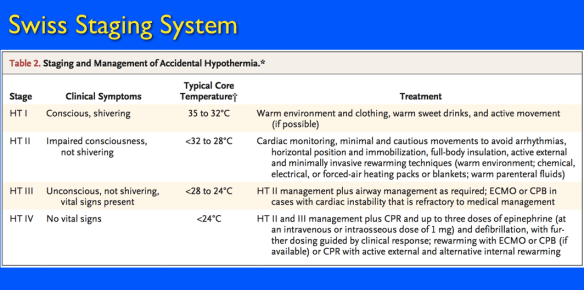
So, I was recently asked to give a talk on Accidental Hypothermia. While I was making the talk, I decided to take a short-cut (aka, I got lazy) and put in a clipped portion of a graph from one of the key papers instead of recreating it myself or trying to use my supergraphic correctly.
Screen Shot 2013-04-21 at 1.12.16 PM

Of course, the slide looked great when I was making the lecture, but it projected horribly! I was standing about 1/2 of the way back in the room and I couldn’t read it myself. This got me thinking. How big is the font in graphics like these? Perhaps if I knew how small the font actually was, it would help motivate me from making this mistake again.

So, I cut out a portion of the graphic and decided to use the phrase “impaired consciousness” to test font sizes.

Screen Shot 2013-04-21 at 1.12.37 PM

As you can see, the font in the graphic is only 16 pt. When directly compared to larger fonts, it seems ridiculous to use in any slide or presentation.

Lesson learned.